|
DETAIL
|
|
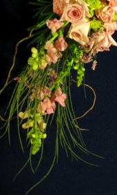
The source image.
As a portrait painter, I often do bride and wedding pictures. and so I often have to deal with wedding bouquets, always from photographs. I can whip out a loose but accurate bunch of flowers in pretty short order, usually toned down so as not to compete so much with the face. This demo was originally intended to be a quick wedding bouquet demo, with perhaps a lace covered arm and some white satin drapery. I ususally give the class a choice of several source images, however, and they chose one that had it's own opinions, and wanted to go in a different direction. I've learned to listen to the painting. I did not want to copy the source verbatim, just use at as a reference for general shape, texture, and color. |
|
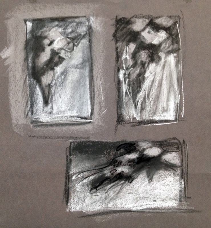
Concept developement.
Thumbnails are the place to work out the composition, and should be quick and simple, showing only the values and shapes. It's easy to try different approaches and easy to make changes with these small fast studies. Usually I only spend a few minutes with each one. The first two thumbnails were still working with the concept of a hand held bouquet, drooping down. I was all set to dive into the second one when my students reminded me that I always tell them to try both horizontal and vertical ideas, so I should do that too. The horizontal one was clearly a more compelling composition, so I abandoned the wedding angle. It was interesting how, as soon as I started thinking horizontally, the whole compositional thought process changed. The large light area at the bottom was necessary to accommodate the linear grass elements, which were my favorite part. |
|
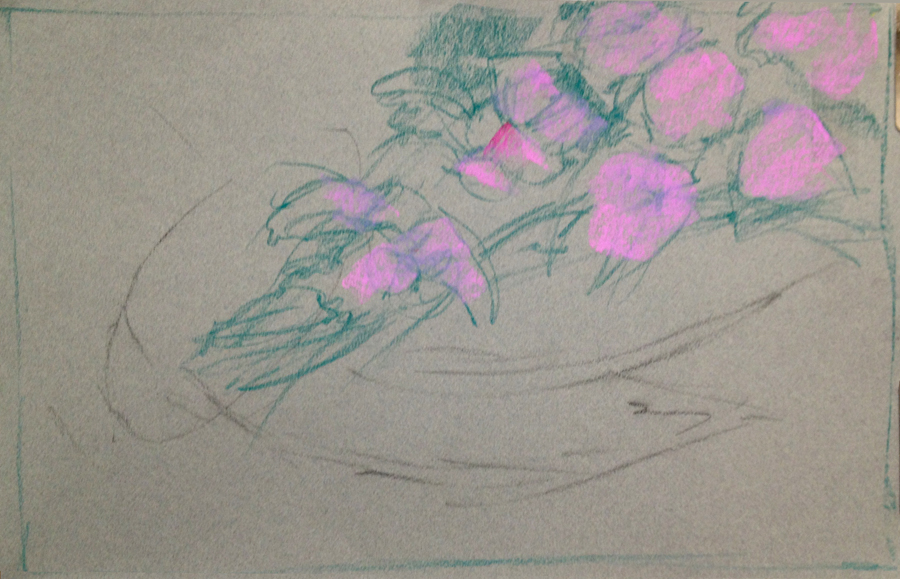
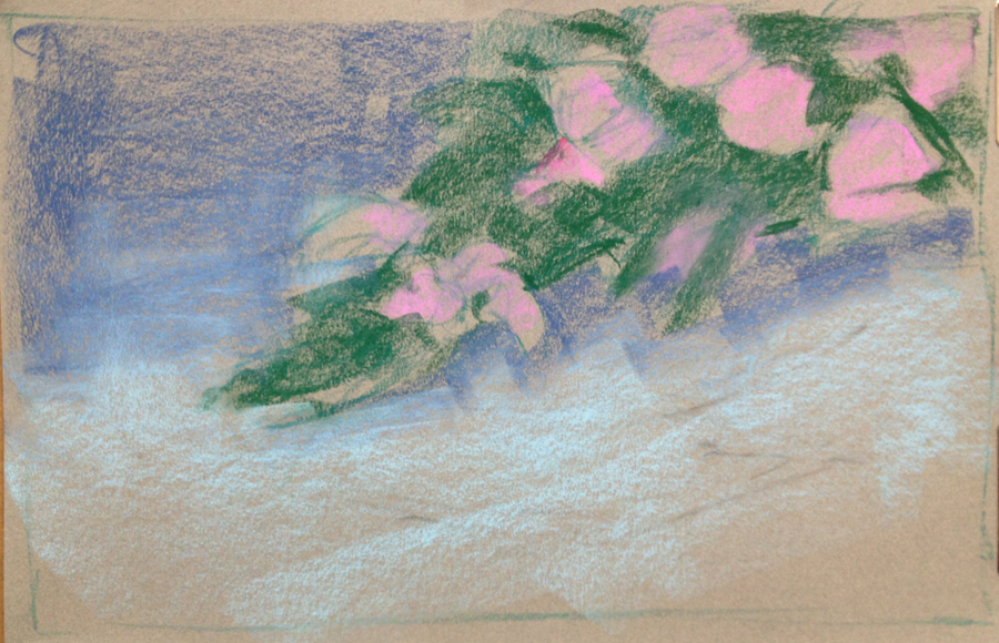
Initial sketch.
The first few marks are always the most critical, as they establish the basic shapes and gestures, the "bones" of the composition. Here I worked with the general color and value of the two elements of the subject: the foliage and the flowers. This lets them begin to exert their influence right from the start. It's a very good idea to stand back regularly and see how it looks from a distance. These pictures were taken each time I stood back to get the overall view. The diagonal of the three big roses at the top left are too straight, too even, and will have to be modified. |
|
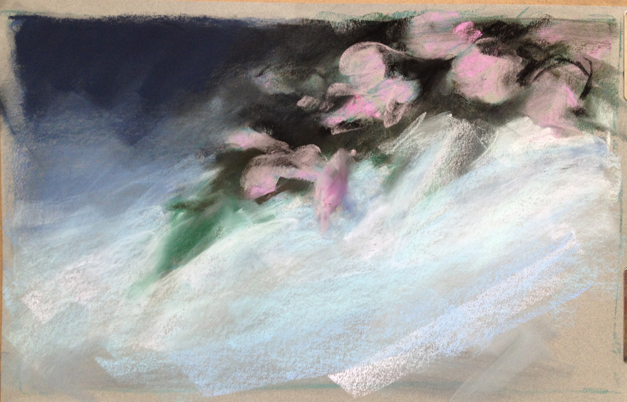
Blocking in.
Now the third element, the back ground, is blocked in, with it's important value blend from dark to light. I also massed in the green shape, observing and refining it's silhouette, and using the darks of the green to start refing the pink shapes as well. |
|
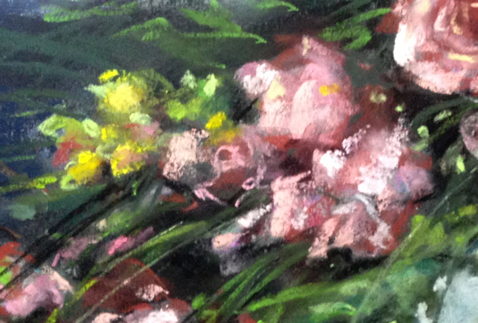
Get the darks In, then the lights. A dramatic step.
Since the insides of bouquets and bushes tend to be very dark indeed, I went right in with black to fill in the tooth of the paper, pushing it in hard so no lighter speckles showed through. This is necessary so that even a dark green mark will show up well against it. Again, I used the dark marks to further refine the light shapes, always refering to the source for guidance before each mark. Next came in the dark blues of the background, as that is much of the drama of the piece. I refined the pink shapes a bit more, and started carving away the main silhouette at the bottom with the light background. |
|
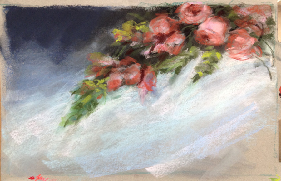
Smaller focus.
With the big shapes well established, I started to focus on the smaller shapes, still staying very loose. I put in the dark tones first, then the middle, and last the light tones for the flowers and then the greenery. It's good to work dark to light, as the light marks are usually the highlights, and should be on top. It still looked top heavy, because of the top notes are usually the highlights and accents. |
|
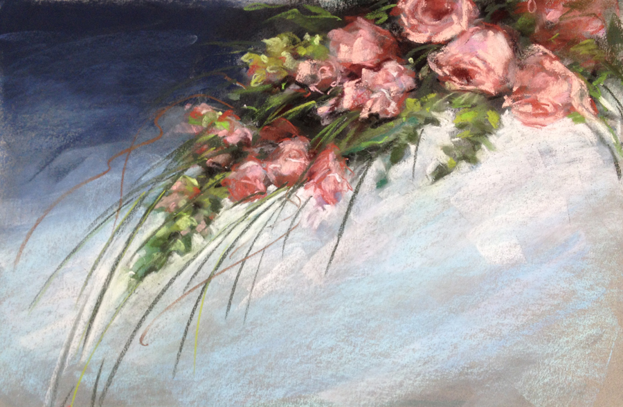
Almost done ...
Finally, I can start getting in the details, and do the fun part. Many artists are so focused on the details that they neglect to get the under structure in first. This would be disastrous for a picture like this, with the long linear elements. Like the whiskers of a cat portrait, these must be the very last layer. I confess to being a little nervous about doing this part, as I am with cat whiskers on my cat portraits. It's not so much fun to have to take them out, and nearly impossible to work around them. |
|
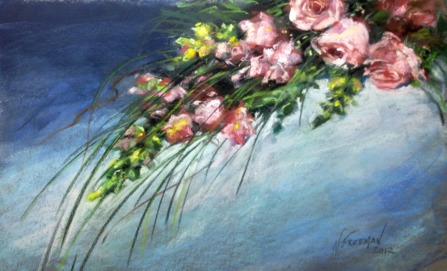
The Fine Tuning Stage
This part is the most fun, and the part that I usually get carried away with and overdo. This is time to put in the top notes, the highlights and accents, the sparkle. I added a few more whiskers, the yellow parts of the snapdragons, and refined and softened the background. Then I stood back. Finished! |