Paintography & Digital Paintings - Step-by-Step Demos
|
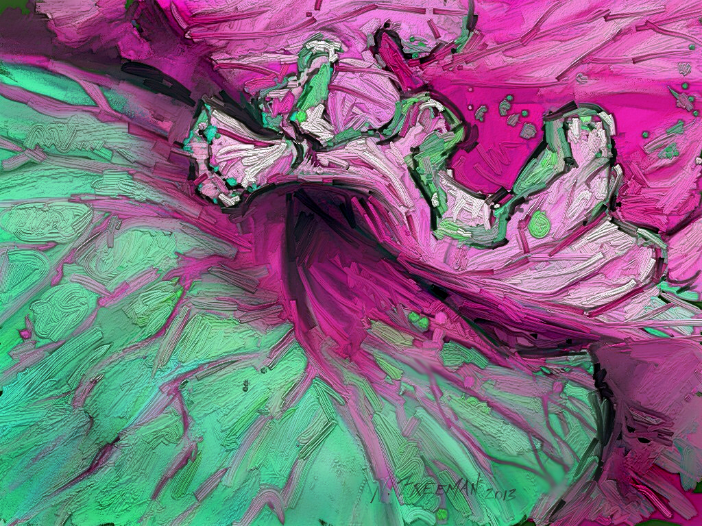
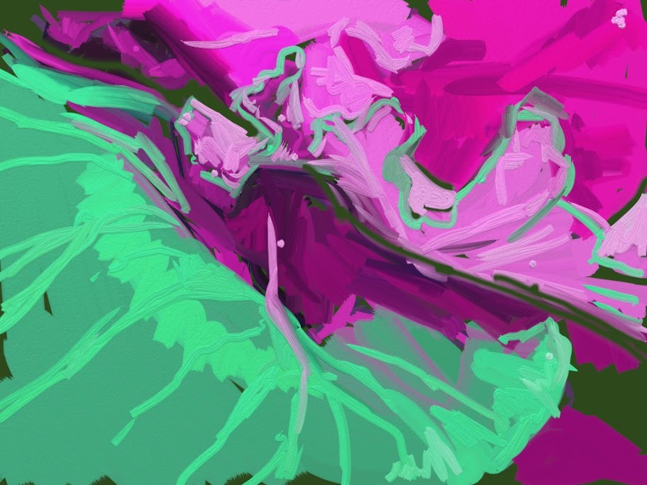
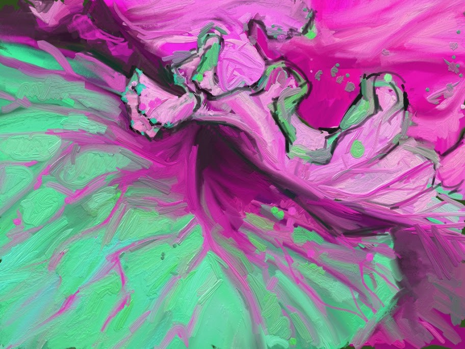
Oil Sketch in Green and Pink
Step-by-step demo Painted in virtual oil paint with ArtRage on the iPad. ArtRage has been around now for several years, and is a very strong multiple media simulation program. I especially like the oil paint. The iPad version is an excellent adaptation, although it is still very low resolution. Click on picture for full size version
|
Oil Sketch in Green and Pink
|
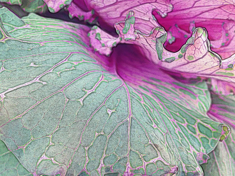

Original
Detail
|
Java Chair
|
Java Chair
7th & North Carolina These distinctive chairs cast equally distinctive shadows on the brick patterned ground, providing strong shapes of light and dark, plus some nice theme-and-variation elements. I used seven layers in the painting part of the process. |
|
Apps used:
Phase one: composition and basics: Auto Adjust Retouch Noise Master Big Photo Phase two: making textures & variations: Paper Camera iColorama Percolator Camera 360 - iPhone only PowerCam ToonCamera Phase three: layering and painting: Photoshop Phase four: fine tuning. Phototshop. |
Each piece of art, digital or traditional, always starts with the basics. For a photo-based piece such as this I start by removing any unwanted elements such as bits of trash or distracting spots. Then the value range needs to be adjusted (leveling) and any color adjustments need to be made. Finally, I crop or stretch or compress or re-arrange or otherwise adjust the composition. It is much easier to do all this in the early stages than to have to change each layer one by one. The next step is to make a number of variations and textures to work with. For this step, I ususally go to my iPad, to use the many speciallized apps. Although there are many effects I can only get there, they are often restricted to smaller resolutions. This is not such a problem for me, since I'm after a painterly look, but it does add some extra steps. For this image I made a dozen or so variations. After contemplating the pieces and determining what direction to go, I chose these six variations to layer, plus a texture I made some time ago of charcoal strokes. For the layering and blending phase, the "painting", there is good control with the blending mode in iColorama and Blender on the iPad, and of course Photoshop on the desktop. |
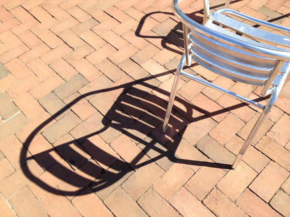
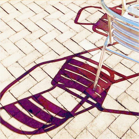
This is the original source, from a favorite local coffee shop with sidewalk seating that gets good afternoon sun. The chairs and tables tend to get moved about a good deal, creating many variations of single and interlocking shadow patterns
|
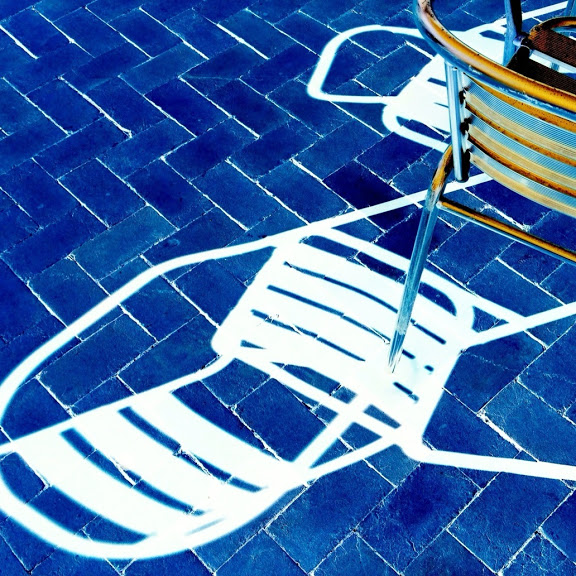
The blue bricks in the negative version from PowerCam were so striking that I chose it as the base layer.
|
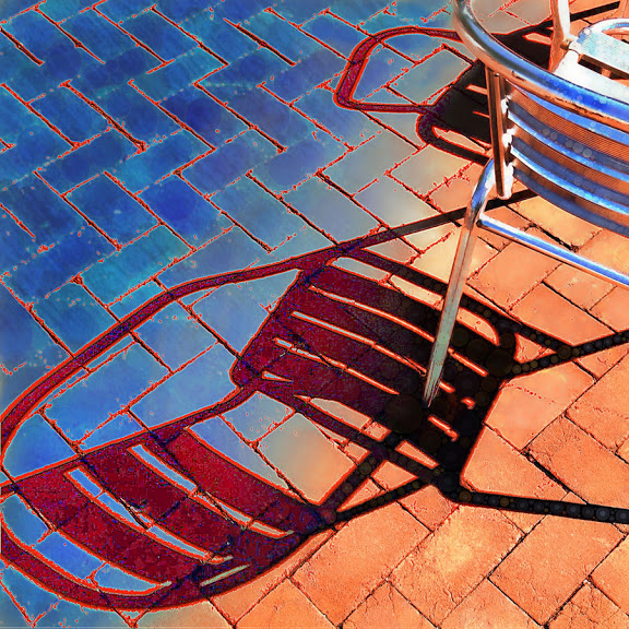
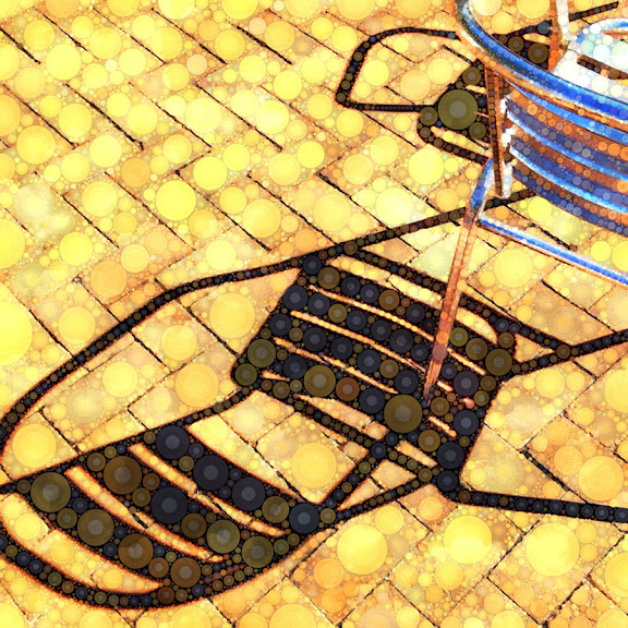
This one, also from PowerCam, provided a marvelous texture and color for the interesting shadow shape.
|

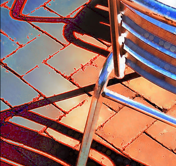
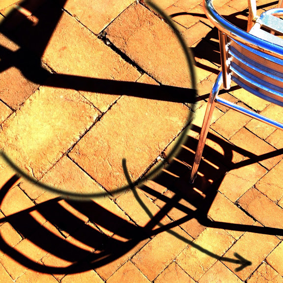
This variant, which could be from several of the apps, provides the outlines. It started out as a black and white, not nearly so contrast-y. I also considered making the outlines electric blue.
|
The bubbles from Percolator are a recurring theme in the Hill Quilt project, and they came from this variant.
|

This is a "smoothed" version made by Noise Master. I used it as a base for many of the variations because of it's simplified texture. The upper right corner of it was used for most of the chair.
|
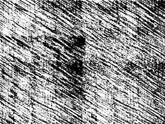
This texture field provided the subtle sketch lines for the upper left corner. They are another recurring theme in the quilt.
|
I wanted to reclaim some of the rough texture from the bricks, which had been largely lost during the various processes. The lower right corner of this image provided that.
|
The Fine Tuning...
When all the layers had contributed their part, I flattened the image and did the fine-tuning. I warmed up the bricks, lightened some areas, darkened others, emphasized a few things, de-emphasized others. I tend to get too involved at this stage, and most of the effects are pretty subtle, but the overall effect is good. |